Ever since I was a kid, I enjoyed drawing, especially mystical places like monster strongholds, secret lairs and abandoned catacombs. Sometimes when I post my maps online, people ask me for advice on how to get started, and even though I’m far from an authority on the subject, I though a short and simple tutorial could be of help, so here goes!
This tutorial will show you how to draw a simple top-down map, with no special features such as furniture or other objects. You can of course add a lot of complexity by adding “dungeon dressing”, or even draw the map from another perspective, such as isometric. But let’s get started with this style.
The gear
A lot of people prefer to draw digital maps, using tools like Photoshop. I, however, prefer to draw by hand.
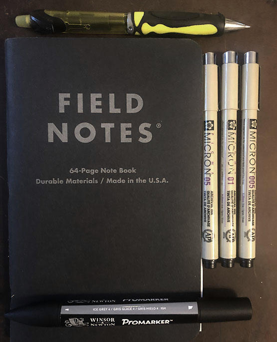
First of all, make sure you have decent tools to work with. For this tutorial, I’ve used three sizes of Micron markers (0.5, 0.1 and 0.05), an ice grey 4 Promarker, a mechanical pencil and a note book with dotted paper, from Field Notes (however, you could just as well use normal grid paper). None of this stuff is especially expensive, and can be bought online. I don’t have a scanner, so all images in the tutorial are taken with an iPhone camera. The end result has had some work done in Photoshop (adjusted levels, removing dots).
Step one: rough outlines
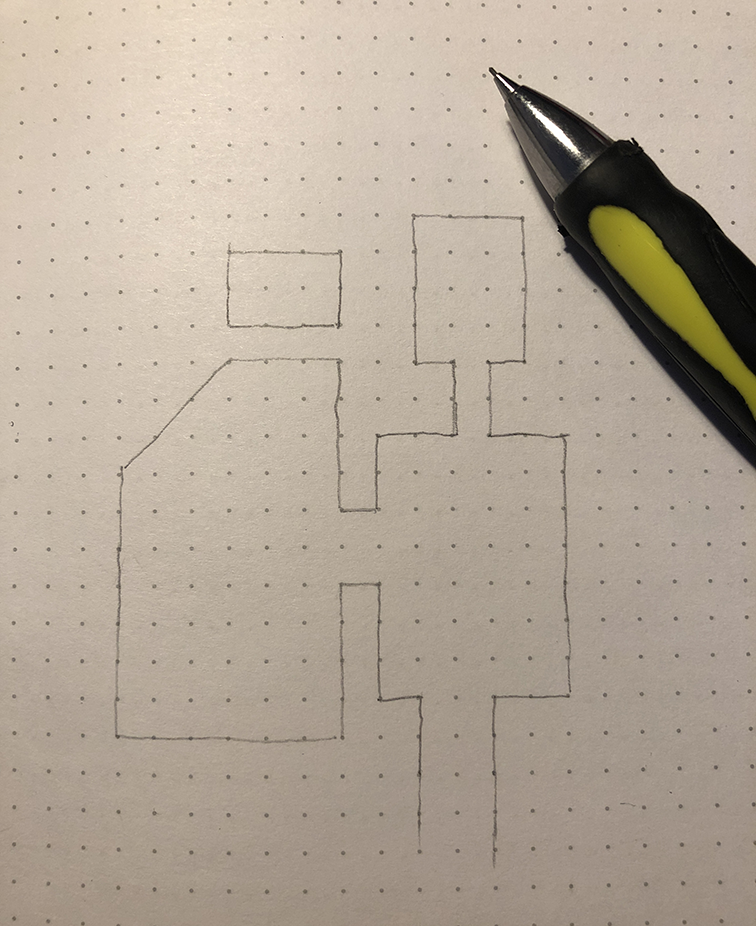
Start by drawing your dungeon walls with a mechanical pencil. It doesn’t have to be perfect straight lines, so no need for a ruler. Imperfect lines gives a nice organic look to the map.
Step two: ink outlines
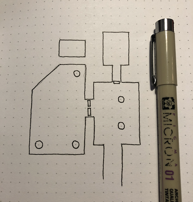
Use a thin (0.1) marker to draw your outlines. Again, it doesn’t have to be perfect. Let the ink dry for a minute, and then erase the pencil lines. This can affect the inked outlines as well, but no worries, we will take care of that in the next step.
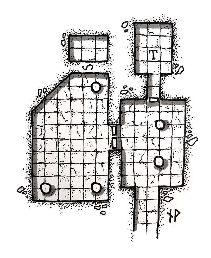
I’ve also added a couple of doors and some pillars to the dungeon. It’s usually a good idea to add the pillars where flagstones will intersect, to provide some nice contrast, as you will see later on in the tutorial.
Step three: add weight to outlines
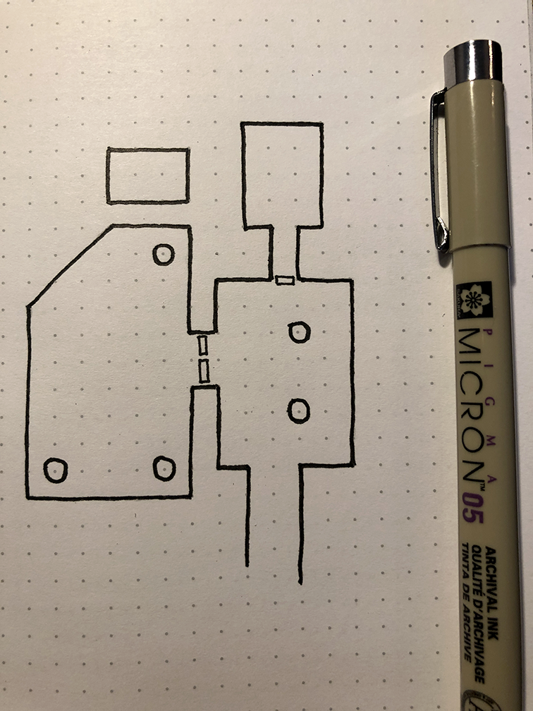
Add weight to your outlines with a thicker marker (0.5)
Step four: draw flagstones
Flagstones are great. Not only do they add nice detail to the dungeon, they also help by providing a grid for the map, making it easier for the dungeon master to draw it on a battle mat should he want to use miniatures for running a combat encounter. Use a thin (0.05) marker to draw the lines for the flagstones.
As you can see, the pillars provide contrast to the flagstone pattern, as they are placed where the flagstones intersect, and not directly on top of a single flagstone.
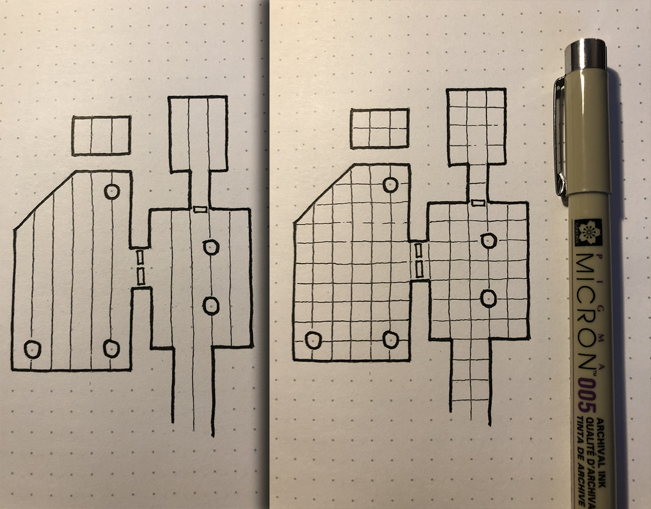
Step five: Add texture
Add some texture to the surface around the dungeon. I like adding some rocks and then use small dots to provide some contrast. The idea is to have a higher “dot density” the closer you are to the dungeon wall. Use a 0.1 Micron marker.
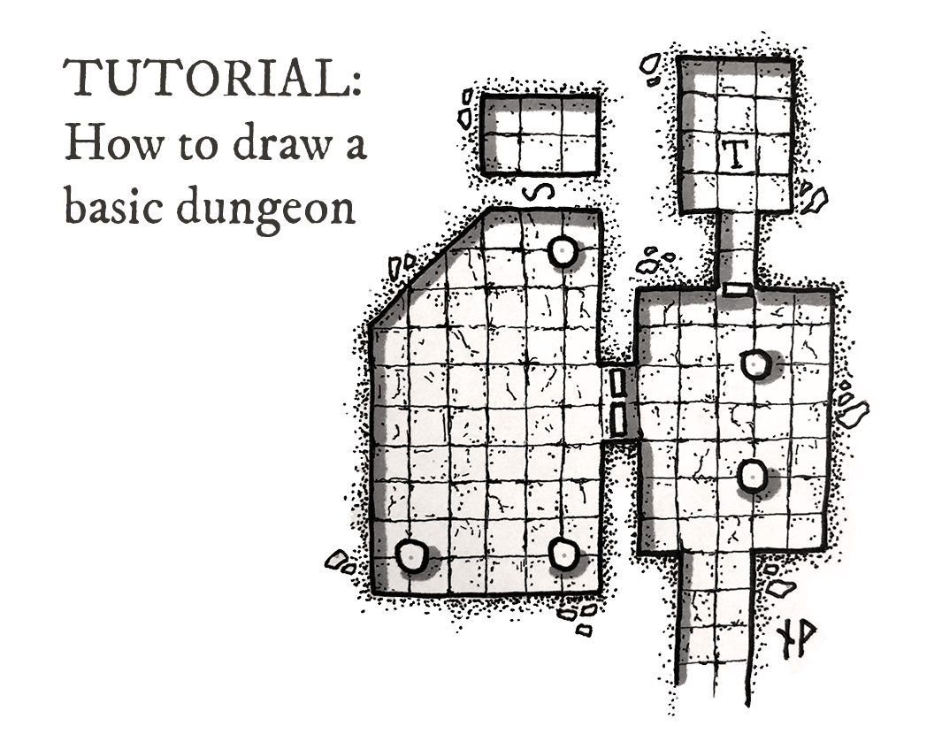
I added an “S” to the map, marking out a secret door that the players will need to search for in order to find.
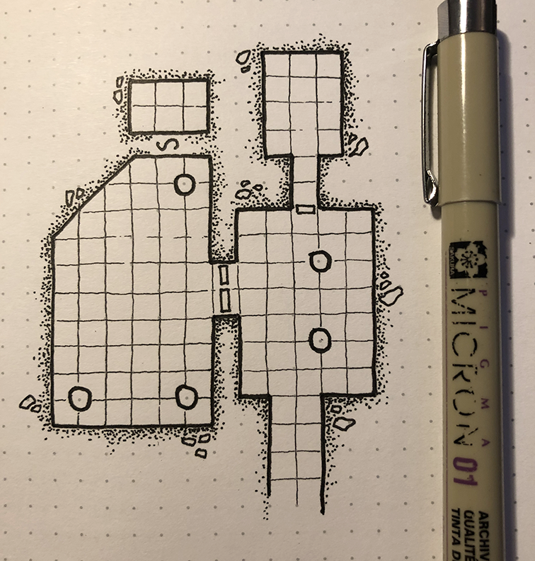
Step six: add texture to flagstones
Add some texture (dots, small scratches, cracks) to the flagstones. Also, randomly emphasise some of the gaps between the flagstones too. Random is the keyword here: don’t repeat patterns as it will look planned and artificial.
Use a thin (0.05) marker for this step.
I decided to add a “T” to one of the flagstones, indicating a trap.
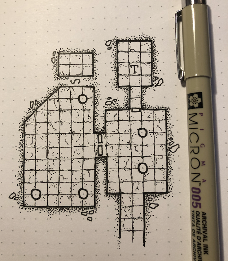
Step seven: add shadows
To add some depth to the map, and making it look a bit more interesting, I add some simple shadows to it. First decide where your imagined light source is located, in this case from the upper left corner. Then add shadows with a marker to the corresponding walls (in this case the upper and left walls). I also added some shadow to the pillars.
Use a grey Promarker (or similar) for this step.
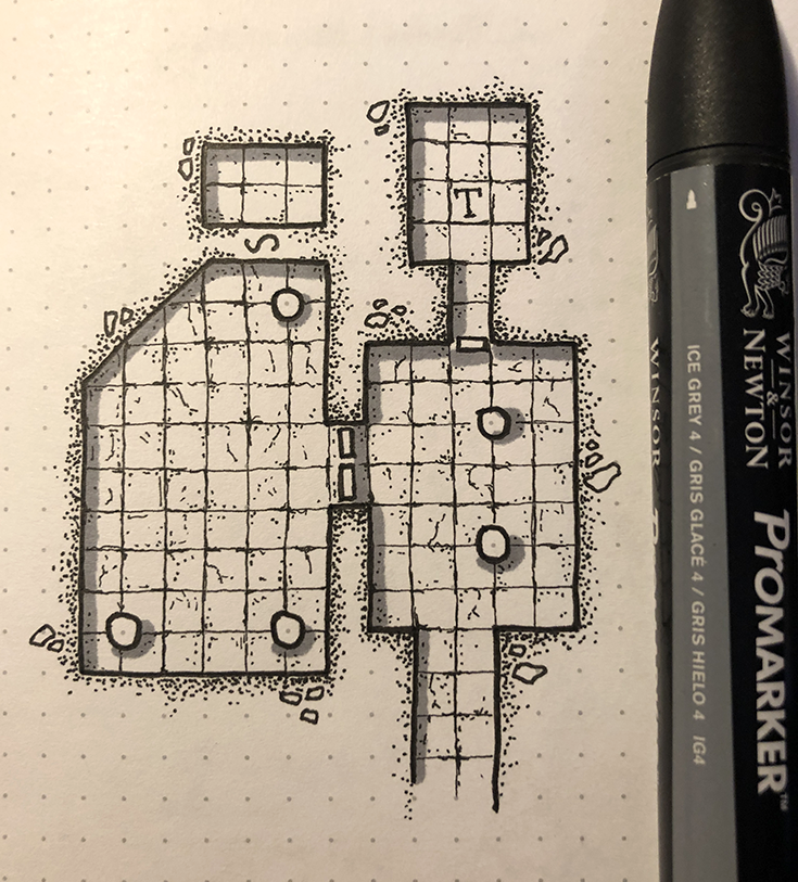
Step eight: clean up
I use my phone to photograph the map I’ve drawn, making sure it’s daylight outside to get a decent picture. Of course, if you have a scanner that’s a much better alternative. I’m considering buying one, but I’m a bit lazy, and also have a small desk.
I then use Photoshop to work with the levels, and getting the colors right, also removing some of the dots.
And there you go, the final result! You now have a dungeon to fill up with monsters, treasure, puzzles and traps. Happy gaming!
If you enjoyed this tutorial, make sure to follow me on Instagram, where I post more maps and tips: https://www.instagram.com/paths.peculiar/
Support my work – buy me a beer (if you want)
If you like my stuff and want to give me a tip to cheer me on, please click the button below.
Please note that tipping is appreciated, but not expected. Don’t donate if you’re short on cash, I’m sharing content because I like to, not to make money.
More tutorials:

Thank you for the very nice tutorial!
I want to underline what I think it is a typo error : in “Step six: add texture to flagstones” you wrote “Use a thin (0.5) marker for this step”, but I think the correct size is 0.05.
🙂
That is indeed an error, thanks for spotting it! I’ve corrected it now.
Hello! How would you make stairs appeare on a basic dungeon map like the one you are showing in this tutorial?
Hello! I usually draw them quite simplified, like on this map: https://www.wistedt.net/2019/06/19/svart-grift-ancient-tomb-dungeon-map/
Hello! Thanks for the Tutorial. I am just beginning myself to use maps like this. Do you have any experience in taking an image like this and printing if for player use in a roleplaying game? I’m wondering about printing them off, and using them as maps. Thanks.
Hi, I have not printed these in larger scale to use as battle mats. The scale here is every square is 5*5mm. I doubt it would look good if printed much larger than that.
Wow I didn’t expect you to respond so quickly. Thanks I was afraid of that.
Hi, these look great and I’m looking forward to giving your tutorial a try. However, you have one step that is easier said than done – “clean up with Photoshop, adjust the levels and remove some dots”. Is there any chance of an explanation of this please? Thanks again.
Here’s a link to a more thorough guide: https://www.wistedt.net/tutorials/tutorial-how-to-clean-up-an-ink-drawing-in-photoshop/
I got some pens today. I’m going to try the tutorial this weekend. Thanks for the post.
Could you do a tutorial on how to do futuristic maps, specifically space stations or ships and the like?
I don’t draw many Sci-Fi maps, but perhaps I’ll do that at some point!
Great and easy to follow tutorial. Thank you!! ?
Thanks, glad you liked it!
I just found your site today while looking for hand drawn character sheets. I absolutely love your work. As a 60 year old aspiring dungeon and map maker I have always loved the old school style of hand drawn maps. I really appreciate your tutorials and especially the pens that you use. I have thought of adding shadow to my maps but had thought about watercolors or colored pencils. I think your method is much easier.
Thanks for your work and I expect to spend a great deal of time here learning and being amazed.
Very happy to hear that, thank you for the kind words and good luck!
This is a superb resource, Niklas, thank you! I’m about as artistic as a house-brick and normally do my (very boring, very functional) maps in Open Office Draw. Twenty minutes following this tutorial, with improvised equipment, and I’m genuinely thrilled by the results! Bravo, and thanks again!
Fantastic, happy you found it useful!
Hello Niklas,
Your style is really beautiful! do you also draw little battle maps on commission? Something that can be used with Ral Partha miniatures?
Thank you 🙂 I’m afraid I don’t do commissions.
Thank you Niklas or this great and pedagogical tutorial! I’m a late blooming GM (right now playing Vaesen) and this tutorial got me really excited and inspired!
Thanks so much! i learned a lot!
I am absolutely coming back to try this. It’s too late at night to start now though. I bought you $6 in beer so hopefully these pages will stay up for a while still 🙂 Keep up the great art and please accept my gratitude for making it available to appreciative guests of your page. Cheers! Doc.
Thank you so much for the kind words and generous tip! Enjoy!
i really love this wedsit it really helps me with my drawings